Bootstrap

Bootstrap is one of the best thing i learned so far, because it makes your website responsive. Responsive means whether you open your website in a mobile phone or a tablet your website will always look good and arranged well.
Bootstrap sleek, intuitive, and powerful mobile first front-end framework for faster and easier web development. A 12-column responsive grid, dozens of components, JavaScript plugins, typography, form controls, and even a web-based Customizer to make Bootstrap your own.
Bootstrap is free that you can download here. Bootstrap offers pre-made button, progress bar, slider or carousel, alerts, thumbnails and also the navigation part of your html, that you can see it all here. To use the bootstrap all you need to do is download it and connect the CSS and JS files.
One of the most used feature of Bootstrap is the Grid System. I will explain and show to you what i learned so far with Bootstrap Grid System. Example Code Below.
1
2
3
4
5
6
7
8
9
10
11
12
13
14
15
16
17
18
19
20
21
22
23
24
25
26
27
28
29
30
31
32
33
34
35
36
37
38
39
40
41
42
43
44
45
46
47
48
49
50
51
52
53
54
55
56
57
58
59
60
61
62
63
64
65
66
<!DOCTYPE HTML>
<html>
  <head>
      <title></title>
      <meta name="viewport" content="width=device-width, initial-scale=1">
      <link rel="stylesheet" href="CSS/style.css" />
      <link rel="stylesheet" href="bootstrap-3.1.1-dist/css/bootstrap.css" />
  </head>
  <body>
      <div id="navigations" class="navbar navbar-default navbar-fixed-top" role="navigation">
          <div class="container">
              <div class="navbar-header">
                  <button type="button" class="navbar-toggle" data–toggle="collapse"
                  data–target="#navbar-collapse" style="background: white;">
                    <span class="sr-only">Toggle navigation</span>
                    <span class="icon-bar"></span>
                    <span class="icon-bar"></span>
                    <span class="icon-bar"></span>
                  </button>
              <div>
                      <a class="navbar-brand" href="#">Brand</a>
                  </div>
              </div>
              <div class="collapse navbar-collapse" id="navbar-collapse">
                  <ul class="nav navbar-nav navbar-right">
                      <li><a href="#">LINK 1</a></li>
                      <li><a href="#">LINK 2</a></li>
                      <li><a href="#">LINK 3</a></li>
                      <li><a href="#">LINK 4</a></li>
                      <li><a href="#">LINK 5</a></li>
                      <li><a href="#">LINK 6</a></li>
                      <li><a href="#">LINK 7</a></li>
                  </ul>
              </div>
          </div>
      </div>
      <div class="container-fluid container-view">
          <h1>BOOTSTRAP CONTAINER</h1>
      </div>
      <div class="col-md-3-container">
          <div class="col-md-3"><h1>BOOTSTRAP ROWS<span>using col–md–3</span></h1></div>
          <div class="col-md-3"><h1>BOOTSTRAP ROWS<span>using col–md–3</span></h1></div>
          <div class="col-md-3"><h1>BOOTSTRAP ROWS<span>using col–md–3</span></h1></div>
          <div class="col-md-3"><h1>BOOTSTRAP ROWS<span>using col–md–3</span></h1></div>

      </div>
      <div class="col-md-6-container">
          <div class="col-md-6"><h1>BOOTSTRAP ROWS<span>using col–md–3</span></h1></div>
          <div class="col-md-6"><h1>BOOTSTRAP ROWS<span>using col–md–3</span></h1></div>
      </div>
      <div class="col-md-9-and-6-container">
          <div class="col-md-9"><h1>BOOTSTRAP ROWS<span>using col–md–9</span></h1></div>
          <div class="col-md-3"><h1>BOOTSTRAP ROWS<span>using col–md–3</span></h1></div>
      </div>
      <div class="rows-inside-a-row">
          <div class="col-lg-3"><h1>BOOTSTRAP ROWS<span>using col–lg–3</span></h1></div>
          <div class="col-lg-9">
              <div class="col-md-3"><h1>BOOTSTRAP ROW inside a ROW<span>using col–lg–9, the inside row col–md–3</span></h1></div>
              <div class="col-md-3"><h1>BOOTSTRAP ROW inside a ROW<span>using col–lg–9, the inside row col–md–3</span></h1></div>
              <div class="col-md-3"><h1>BOOTSTRAP ROW inside a ROW<span>using col–lg–9, the inside row col–md–3</span></h1></div>
              <div class="col-md-3"><h1>BOOTSTRAP ROW inside a ROW<span>using col–lg–9, the inside row col–md–3</span></h1></div>

          </div>
      </div>
  </body>
      <script type="text/javascript" src="JS/jquery-2.1.0.js"></script>
      <script type="text/javascript" src="bootstrap-3.1.1-dist/js/bootstrap.js"></script>
</html>
You can see in the code that i use classes like col-md-3, col-md-6, col-lg-9 and row, this are the classes that are already been set-up in bootstrap CSS and JS. If you can notice in the Navigation part, there are different classes that i use these are the classes that you need to use to make your Navigation be responsive when your website will be open in a mobile or a tablet, for more understanding click the link above that i give and find the Nav part their. With the use of the classes in bootstrap in helps your website presentable in any type of gadgets. Additional information is that you can overwrite the Bootstrap CSS.
Output of the code is here. All I do in CSS part are adding color and changing the heights. Resize the window or open the url in your phone or tablet so you can see how Bootstrap works with different sizes of a window.
Grid System
(additional Information)– Using class=“CONTAINER”
1
2
3
4
5
6
<div class="container">
  <div class="col-md-3"><span>using col–md–3</span></div>
  <div class="col-md-3"><span>using col–md–3</span></div>
  <div class="col-md-3"><span>using col–md–3</span></div>
  <div class="col-md-3"><span>using col–md–3</span></div>
</div>
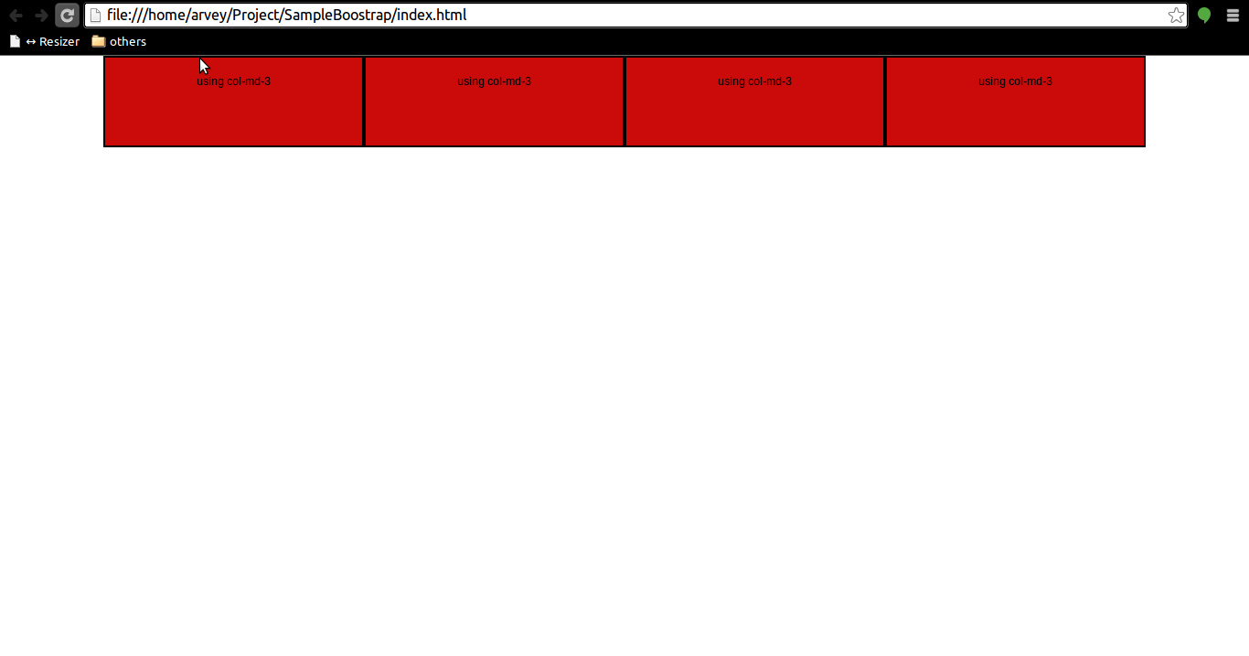
– Web View

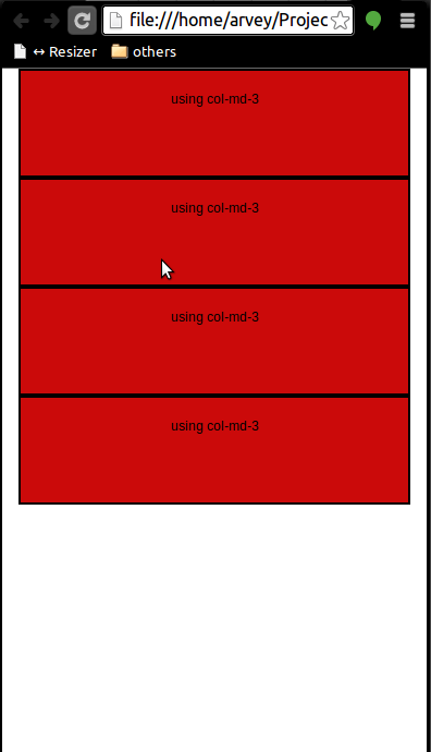
– Mobile View

Container class will make your your content in a center having a margin-left and margin-right .
– Using class=“row”
1
2
3
4
5
6
<div class="row">
  <div class="col-md-3"><span>using col–md–3</span></div>
  <div class="col-md-3"><span>using col–md–3</span></div>
  <div class="col-md-3"><span>using col–md–3</span></div>
  <div class="col-md-3"><span>using col–md–3</span></div>
</div>
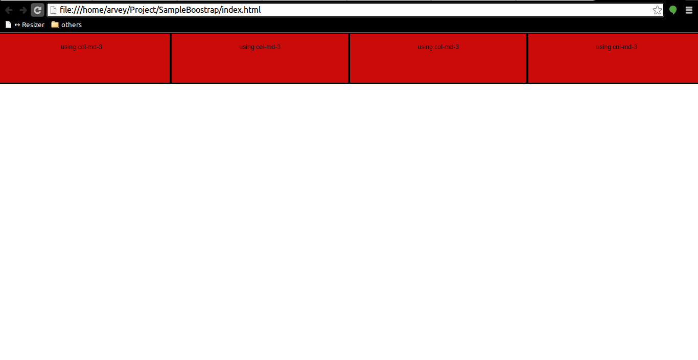
– Web View

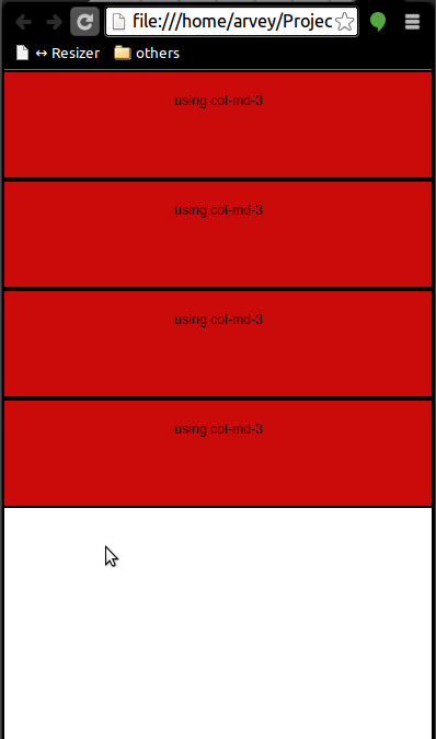
– Mobile View

Row class dont have a margin-left and margin-right. Click here for more information of bootstrap CSS class.

